Box model
Everything is made of boxes
The base of web design is rectangular boxes. Everything is a box, before and after CSS is applied. This is a simple concept, but worth repeating because it has bearing on so much of the CSS you’ll write and how elements interact with each other.
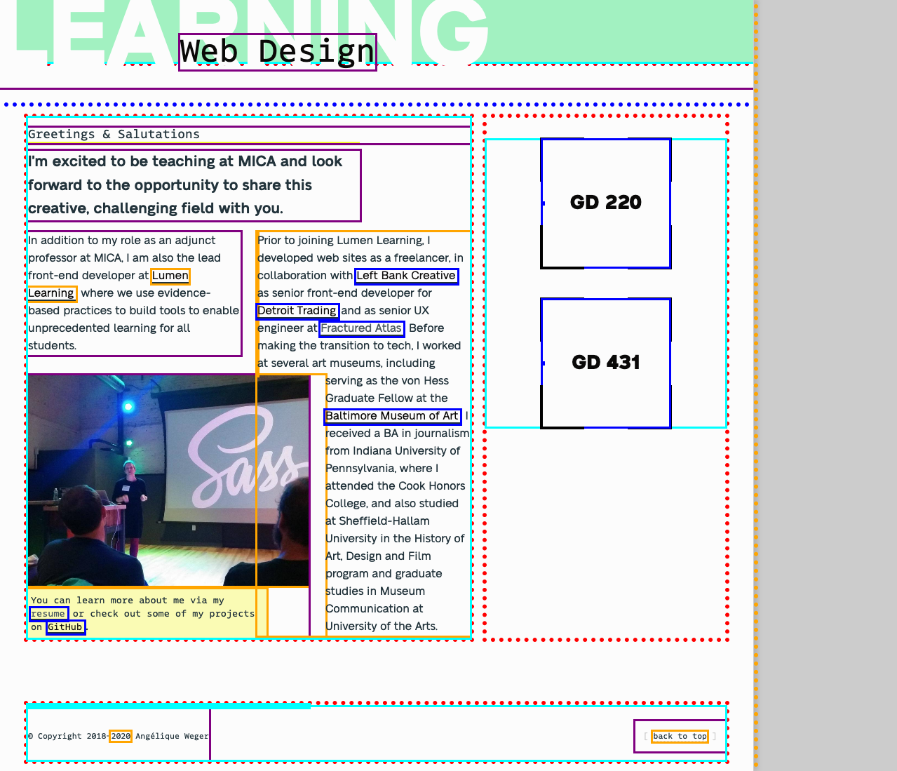
In this screenshot, I have used CSS to add solid and dotted borders around the various HTML elements on this site’s homepage, making visible all the boxes, including some overlapping:

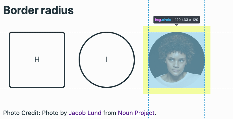
Even in this example, where an img element has been modified using border-radius: 50%, when you highlight the element using the browser dev tools, it is still treated as a rectangle (in this case, specifically a square).

You can see this for yourself by using your browser dev tools on this Glitch project.
What makes up a box
These underlying boxes are made up of the following components:
- content (not just text, but also images, other elements, etc.)
- size (width and height)
- padding
- borders
- margin
These components are listed from innermost to outermost, so an element’s border encloses its padding, dimensions and content. The CSS box model refers to how these different components work together to result in what you see in your browser.
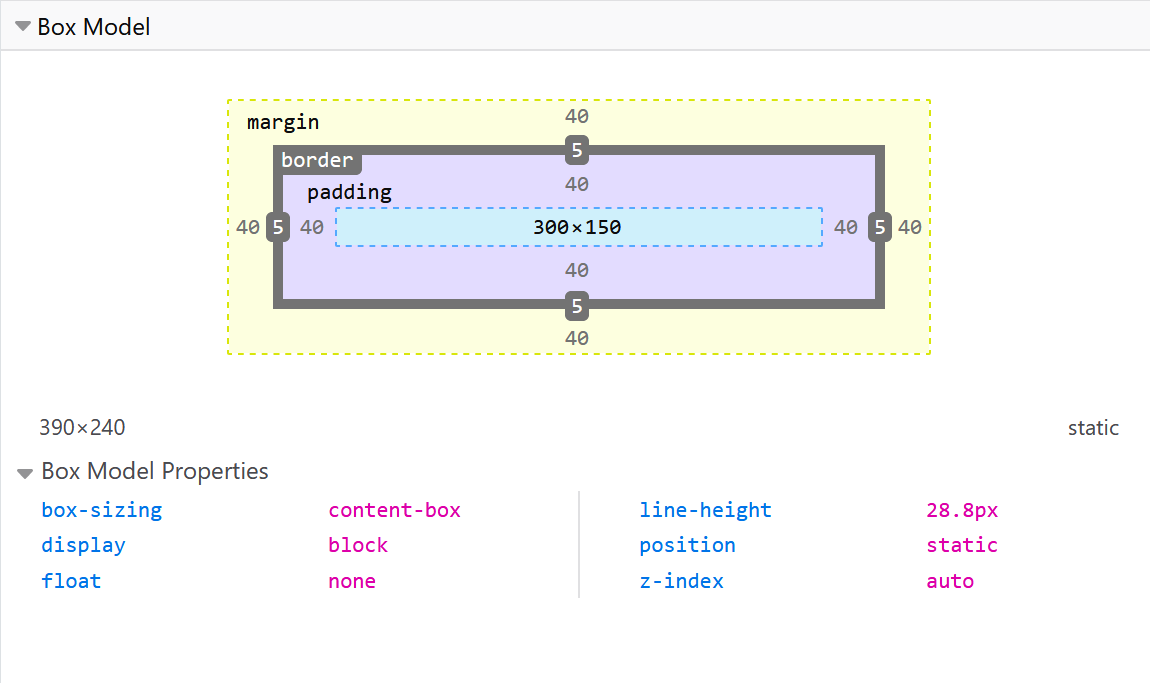
Both Firefox and Chrome developer tools include a diagram of the box model of any element you inspect; this screenshot is from Firefox dev tools:

From the screenshot above, you can see the element’s:
- content and/or dimensions (light blue) are 300x150 pixels
- padding (light purple) is 40 pixels on each side
- border (grey) is 5 pixels on each side
- margin (yellow) is 40 pixels on each side
Box sizing
Both of the divs in this demo use these same values for height, width, padding, border and margin.
The difference comes from a CSS property named box-sizing. By default, browsers apply a value of content-box. This means that an element’s final size is a calculation of its dimensions (width/height) + padding + border. So, while both divs have a width value of 300 pixels and height of 150 pixels, the first box also adds in the values for padding and border, like so:
300 + 40 + 40 + 5 + 5 = 390 pixels wide
width + padding-left + padding-right + border-left + border-right
150 + 40 + 40 + 5 + 5 = 240 pixels tall
width + padding-top + padding-bottom + border-top + border-bottom
While you likely can follow along with this logic when it’s written out like this, there’s still something deeply unintuitive about an element with a width value of 300 pixels being 390 pixels wide.

Luckily, this confusing default behavior can easily be overridden by updating the box-sizing value from content-box to border-box instead. Using this value means an element’s set width and height values are not affected by padding or borders; simply, your 300-pixel box is 300 pixels wide, as in the second example above.
You can easily apply this setting to all your HTML elements by using the universal selector, which is the asterisk (*):
* {
  box-sizing: border-box;
}
You may have already seen this code, as it is included among the CSS best practices I recommend.